ShopDreamUp AI ArtDreamUp
Deviation Actions


Suggested Deviants


Suggested Collections


You Might Like…


Featured in Groups

Comments3
Join the community to add your comment. Already a deviant? Log In
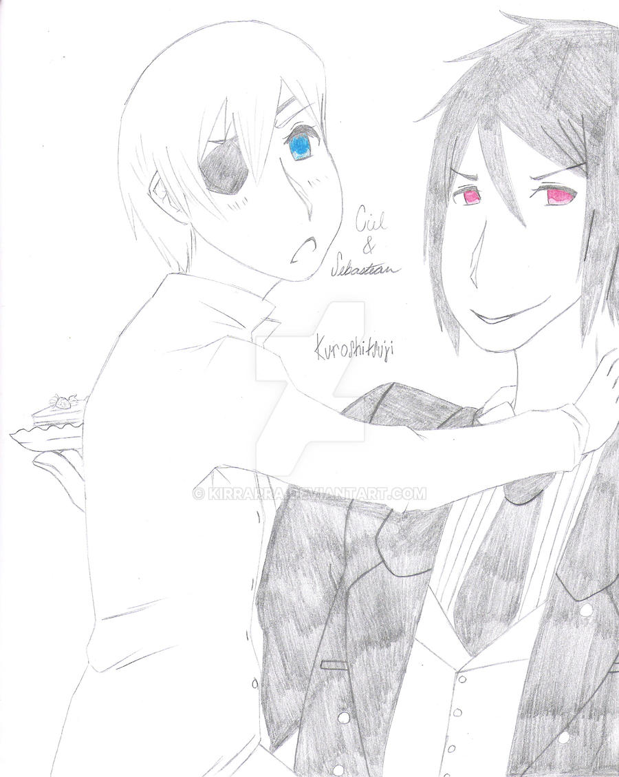
Not bad, in fact a very good start. If i manke any unneccessary comments, please knwo that i mean no offense. So let's begin shall we?
Color: um, you're kinda sparse in the area. If you only wanted to color their eeys to make them stand out, that's jkust fine....actually sometimes, it makes the picture even more dramatic. However, in this case, it makes the rest of the picture weaker.The main problem is that yo udon't have a really good dark/light pattern....nothign really pops out, besides the eyes. It's just that, aside form the bright colors, every else is either white or like a light ot medium gray. You lack a lot of true dark. Don't be afraid to press hard on the pecil or use shadows....a picture is defined by it's shadows. For example if you could put Ciel infront of somehtig nblack...he'd pop right out and make the picture stronger.
Placement: no complaints, you have pretty good placement. The pic is blanced well and thus there is littlem ore i can say......except i might have put them lower on the page just a tad...but that's more a matter of personal taste.
Proprtions: The look abour right...only I think the collar of a dress shirt is higher than that...but whatever, i'm ebign picky.
So any way, eyah, you're off to a good start...um just owrk on stressing certain areasn and gettig na good contrast